DE
Salzerbau hat ein Corporate Design beauftragt, das die technisch hochwertige Arbeit des Baumeisterbetriebs im Erscheinungsbild widerspiegeln soll. Alle Projekte von Salzerbau haben eines gemeinsam: den Bauplan. Ausgehend davon leiten sich das Logo und der Farbraum ab. Da das Konstruieren im Mittelpunkt der Arbeit steht, wird das Design selbst zum Konstrukt. Die Visitenkarten haben zwei gestanzte Schlitze, die den Buchstaben S für Salzerbau ergeben. Dadurch werden die Visitenkarten zu kombinierbaren Bausteinen.
EN
All "Salzerbau" projects have one thing in common, and that is the construction plan. It provides the seedbed for the logo and the colour concept. Constructing is at the heart of the work, meaning that the design itself becomes a construct. Two slots have been punched into the business cards, turning them into combinable building blocks.
Derivation

Business card with 2 slots

Business cards in use
(The business cards symbolise bricks; by sticking them together in different ways they create the impression of a building.)

Letter

Envelope DIN C4

Envelope DIN C5/6

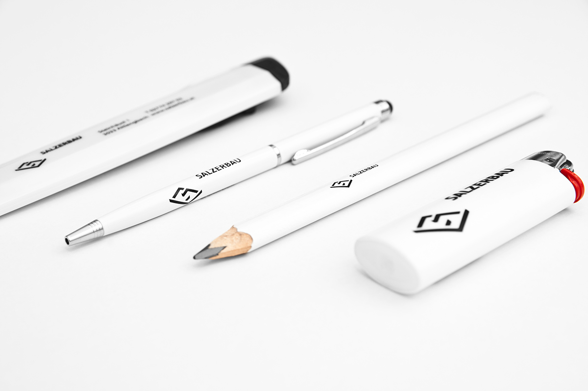
Give aways
Sign

Signpost

laser-cut plate


